The Power of Contrast
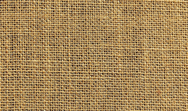
Flat design isn’t just dull it’s forgettable. Combining textures and patterns is how interiors get character. Think of contrast like seasoning: a little rough burlap next to a soft velvet, or a bold stripe beside a quiet herringbone. It’s how you create tension that feels intentional, not chaotic. This interplay keeps a space dynamic and layered, not static and sterile.
Designers rely on contrast to dodge the one note look. A room done in all matte finishes or all polished surfaces falls flat fast. The trick? Juxtapose. Mix the sleek with the rugged. A glossy subway tile next to raw wood shelves can change the whole mood of a kitchen. Even tiny things like a chunky knit throw over a smooth leather chair add depth.
Still, plenty of people hesitate. One major misconception is that mixing patterns and textures will make things look messy. But messy happens when there’s no visual hierarchy. Contrast doesn’t mean chaos it means purposefully placing opposites to highlight each other. The key is balance. Once you see it working, you can’t unsee it.
This is the stuff that turns a space from fine to memorable. And it’s not hard. It just takes intention.
Solid Ground Rules That Actually Work
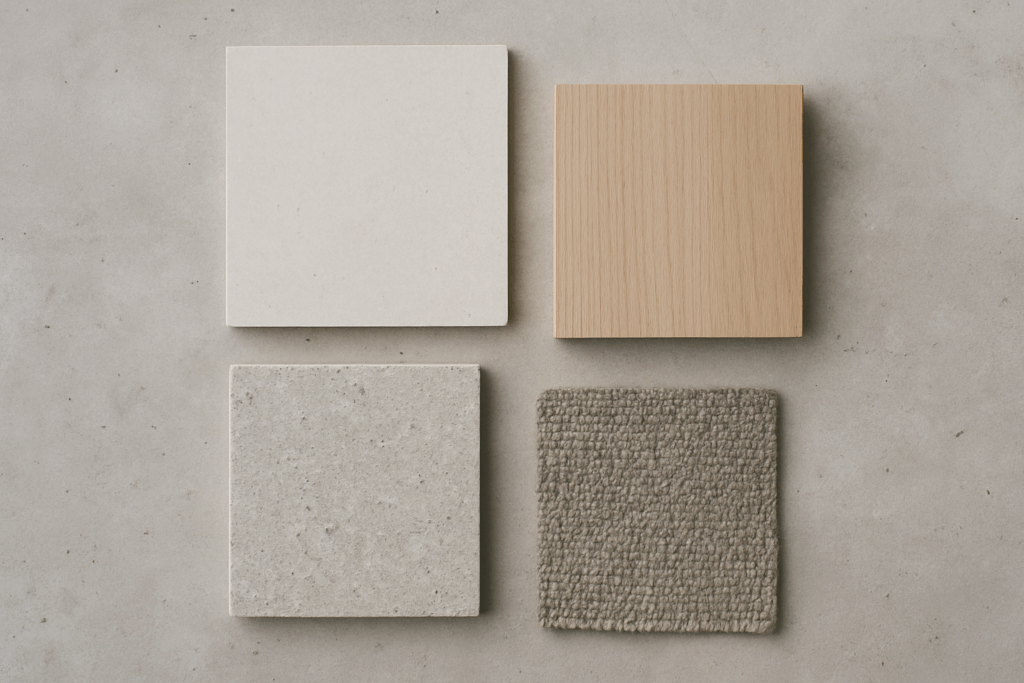
Start simple. A neutral base think whites, beiges, grays, or soft earth tones gives you stability. It’s your clean slate. This layer keeps your space grounded when you start adding bolder elements. Whether you’re working with walls, large furniture, or floor coverings, neutrals set the tone so nothing feels chaotic.
Now, layering is where things get interesting. The magic number? Three. Look for a mix of pattern, texture, and color. Add a bold stripe, a chunky knit, and a pop tone just not all screaming at once. You’re building complexity, not clutter. This framework helps keep things intentional and sharp.
Last, keep one core element steady. Choose consistency across color, scale, or theme. Maybe everything speaks in muted tones, or maybe the patterns all stick to organic shapes. Whatever you anchor, it ties the scheme together and keeps it from feeling like a yard sale.
It’s not about being rigid. It’s about being crisp on direction, so the space tells a story without shouting over itself.
Texture 101: Hard vs. Soft, Matte vs. Gloss
Getting texture right is all about balance and guts. It’s the friction between rough and smooth that makes a space feel layered, not staged. Think warm wood next to cool metal, or crumpled linen draped across a velvet armchair. It’s not just contrast it’s chemistry.
But too much of any one thing, and you lose the plot. That’s where finishes come in. A high gloss lacquer table paired with matte ceramic or untreated stone adds structure without looking overworked. The trick is in the pacing: one sheen heavy surface can be an anchor, but let raw textures dance around it to keep the look grounded.
Light, of course, changes everything. In daylight, matte surfaces absorb and soften. At night, under artificial lighting, glossy finishes bounce light back, exaggerating depth and creating warm or cool highlights depending on the bulb. So don’t just pick textures test them at different times of day. A room’s identity shifts as light plays off its surfaces. The designers who get it right know it’s not just about what you pick it’s about how it lives in real time.
Pattern Pairing Without the Chaos

Mixing patterns can look like design genius or a headache depending on how you approach it. The key isn’t to avoid bold combinations like florals with geometrics or stripes with abstracts. It’s to balance them. A structured stripe can ground a wild floral. An abstract print can add energy next to a rigid grid. Pick patterns that contrast in style but relate in tone or color. That way, even the most unexpected combos feel intentional.
Scale is your silent partner here. Layer a large scale floral with a tight, small scale geometric. Or pair broad, chunky stripes with a delicate abstract. Varying the size of your prints adds movement and keeps your space from feeling stiff. If everything’s the same size, the eye gets overwhelmed fast.
And here’s the part most people skip: visual rest. Your eyes need it. Areas of solid color, plain materials, or clean lines aren’t boring they’re essential. They give the eye somewhere to settle and make your bolder choices stand out even more. Without quiet zones, chaos takes over. With them, your space breathes.
Real World Examples That Nail It
Let’s get right into it: three rooms, three vibes, all leveraging contrast and cohesion like a pro.
The cozy boho living room leans into warmth and personality. Tossed throw pillows in global patterns, a chunky knit throw over a low slung couch, and layered rugs set the mood. Rattan chairs and woven baskets bring in organic texture while color blocking think mustard clashing gently with terracotta keeps things playful but intentional. It’s not clutter; it’s controlled chaos done right.
Modern industrial dining space? That’s a different beast. Here it’s about clean lines with grit. A steel framed dining table meets reclaimed wood. Pendant lighting in matte black casts warm shadows over mixed metal accents nickel hardware and a brass fruit bowl? Surprisingly tight combo. Softness shows up in small ways: leather seat cushions, maybe a linen runner. Natural grain against cold metal keeps it grounded.
Scandinavian chic bedroom skews softer, more thoughtful. Think layers: a pale wood bedframe, washed linen sheets, and thick knit throws. Patterns stay quiet maybe a muted grid or tiny floral on a pillow but they play well with textures like velvet, wool, and brushed cotton. Minimalist? Yes. Boring? Never. The trick is to keep the palette soft but not sterile, with just enough pattern to keep the eyes moving.
Craving more style combos that balance bold and believable? Browse our full guide: Mixing Patterns and Textures.
Mistakes to Avoid (If You Want Pro Vibes)
Let’s be clear: matching everything doesn’t make your space look polished. It makes it look flat. Rooms with too much coordination same fabrics, redundant color palette, copy paste patterns feel more like showroom displays than real, lived in spaces. Interesting interiors have contrast, surprise, a bit of clash. Your personality lives in what doesn’t match perfectly.
Then there’s lighting. A texture might look cozy and rich at noon but dull and muddy under warm bulbs. A bold pattern might pop in natural light and turn chaotic at night. Always view your design choices across lighting conditions. Otherwise, that sleek modern vibe you chased in daylight might turn oddly sterile after sunset.
Finally, don’t lose sight of function. A velvet bench may look great on camera, but if you’re using it as a coffee table or stacking laundry on it daily, it’ll wear out fast. Design isn’t just about aesthetics it has to serve how the space gets used. Cool only works if it holds up in real life.
Ready to Try It?
Start with one space. A single room is plenty less overwhelm, more focus. Choose three foundational layers: a solid neutral to ground the space, one patterned element (like a rug or wallpaper), and one texture that brings some physical contrast maybe woven, maybe velvet, maybe hammered metal. This trio gives you structure without locking you into a rigid formula.
The key is to move things around and keep adjusting until it feels right. You don’t need design school for this. If something looks off to you, it probably is. Shift the pattern. Swap the fabric. Let your instincts lead.
Need extra backup or more inspo? Dig into our full guide: Mixing Patterns and Textures.
 Rovelle Vosswynne has opinions about gardening and landscaping tips. Informed ones, backed by real experience — but opinions nonetheless, and they doesn't try to disguise them as neutral observation. They thinks a lot of what gets written about Gardening and Landscaping Tips, DIY Project Tips, Home Renovation Ideas is either too cautious to be useful or too confident to be credible, and they's work tends to sit deliberately in the space between those two failure modes.
Reading Rovelle's pieces, you get the sense of someone who has thought about this stuff seriously and arrived at actual conclusions — not just collected a range of perspectives and declined to pick one. That can be uncomfortable when they lands on something you disagree with. It's also why the writing is worth engaging with. Rovelle isn't interested in telling people what they want to hear. They is interested in telling them what they actually thinks, with enough reasoning behind it that you can push back if you want to. That kind of intellectual honesty is rarer than it should be.
What Rovelle is best at is the moment when a familiar topic reveals something unexpected — when the conventional wisdom turns out to be slightly off, or when a small shift in framing changes everything. They finds those moments consistently, which is why they's work tends to generate real discussion rather than just passive agreement.
Rovelle Vosswynne has opinions about gardening and landscaping tips. Informed ones, backed by real experience — but opinions nonetheless, and they doesn't try to disguise them as neutral observation. They thinks a lot of what gets written about Gardening and Landscaping Tips, DIY Project Tips, Home Renovation Ideas is either too cautious to be useful or too confident to be credible, and they's work tends to sit deliberately in the space between those two failure modes.
Reading Rovelle's pieces, you get the sense of someone who has thought about this stuff seriously and arrived at actual conclusions — not just collected a range of perspectives and declined to pick one. That can be uncomfortable when they lands on something you disagree with. It's also why the writing is worth engaging with. Rovelle isn't interested in telling people what they want to hear. They is interested in telling them what they actually thinks, with enough reasoning behind it that you can push back if you want to. That kind of intellectual honesty is rarer than it should be.
What Rovelle is best at is the moment when a familiar topic reveals something unexpected — when the conventional wisdom turns out to be slightly off, or when a small shift in framing changes everything. They finds those moments consistently, which is why they's work tends to generate real discussion rather than just passive agreement.