Ground the Room with Base Tones
Creating a well-designed space starts with a strong foundation. Base tones such as white, gray, and beige help set the tone and allow other design elements to shine.
Why Base Tones Work
Neutral colors create a calming backdrop and ensure your space doesn’t feel too busy or overwhelming. They also offer flexibility, letting you update or swap out accent pieces without starting from scratch.
- White provides a clean, airy feel and enhances natural light
- Gray brings modern sophistication and pairs well with both cool and warm elements
- Beige adds warmth and a subtle organic touch
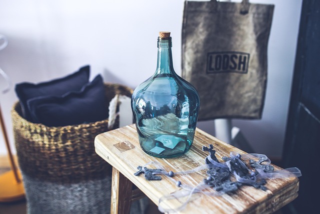
Let Textures and Patterns Take Center Stage
Once your base is set, layering becomes key. Use texture and pattern to add depth and character without overpowering the space.
- Consider woven rugs, linen fabrics, or brushed metals for texture
- Use subtle prints like stripes or geometrics to add visual movement
- Let bold patterns shine by keeping the surrounding elements minimal
Balancing Bold and Subtle Elements
A balanced room blends statement pieces with understated design for a cohesive look. Start with a neutral foundation, then carefully introduce color or dramatic accents.
- Limit bold pieces to one or two focal areas
- Use artwork, throw pillows, or accent chairs as places to introduce color or pattern
- Keep adjacent elements simple to let standout items feel intentional, not chaotic
Texture and pattern aren’t just decorative extras. They shape how a space feels. Rough linen next to slick metal. Bold stripes against soft neutrals. These contrasts create energy and give a room its own personality. They can ground your design or push it into new territory.
There’s a difference between what you see and what you feel. Visual texture is illusion—like a wallpaper that looks woven but is smooth to the touch. Tactile texture is the real deal—something you can run your hand across and sense the detail. Layering both brings complexity without clutter.
Pattern isn’t just about prints or graphics either. It’s rhythm. It’s direction. Repeating elements give a space tempo. Movement. It tells your eye where to go. Whether it’s a geometric rug or brushstroke art, pattern sets the tone. It sparks mood—and that’s what makes a well-designed room stick with you.
Contrast is your friend. Good vlogging sets lean into layering not just in story, but in the textures that fill the frame. A polished steel mic stand against a wool throw. Raw wood shelves next to a velvet couch. These combinations do more than look cool — they create depth and mood without trying too hard.
Natural materials like cotton, leather, and stone bring warmth and a sense of reality. Synthetic textures like acrylic or performance fabrics bring structure and pop. Neither is better than the other — it depends on the vibe you’re going for. Use synthetics when you want sleek and clean. Go natural when your content leans personal or grounded.
The best setups mix rough with smooth: matte walls with glossy accents, chunky knits by brushed metal. The tension between textures gives your background some subtle drama. And in 2024, subtle is the new loud.
Mixing patterns in your vlog setup or personal branding doesn’t have to mean chaos. Start with a tight color palette. Even if your patterns are loud, shared tones keep things grounded. Think earthy pinks, muted greens, or black and white—it all holds better when your colors talk to each other.
Next, play with scale. Combine wide stripes with dainty florals, or big geometrics with tiny dots. The contrast adds structure without visual overload. Then anchor it all with a unifying element: shape, texture, or tone. Maybe it’s organic curves across patterns. Maybe it’s a repeating accent color.
When in doubt, go with tried-and-true pairs. Stripes and florals balance each other well—one brings order, the other, softness. Geometrics next to solids? Safe bet. The key is editing with purpose. Let each element earn its spot.
Lighting isn’t just about brightness—it’s about mood, texture, and clarity. Natural light brings out the subtle details in patterns, making textures pop and shadows come alive in a way artificial sources rarely match. Morning sun across a woven rug or soft afternoon light hitting a brick wall can completely transform the feel of a space on camera.
Artificial lighting, on the other hand, tends to flatten or over-sharpen. LED panels and ring lights have their place, especially for consistency, but they often miss the emotional depth that comes from sunlight. Overly lit scenes can wash out textures or make patterns look sterile. If the vibe feels off, the lighting setup might be to blame.
If you’re designing a space with vlogging in mind, prioritize windows, light-colored surfaces, and strategic positioning. It matters more than gear sometimes. For deeper tips on getting light right, check out our guide on Designing for Natural Light.
Design overload is real, and it’s one of the fastest ways to break a vlog’s visual flow. When too many textures, colors, or prints fight for attention, the viewer’s eye doesn’t know where to land. What might look bold in a thumbnail can quickly turn chaotic in motion.
Just as risky: mixing styles that don’t speak the same visual language. Think industrial chairs with baroque wallpaper or minimalist lighting paired with maximalist props. There’s nothing wrong with bending the rules, but if eras or tones clash too hard, it feels less like creative contrast and more like confusion.
Then there’s scale. Oversized elements can crowd a frame, while too many small details can feel cluttered. Great-looking vlogs keep a sense of balance—visually and spatially. Every object in the background should feel like it belongs and supports the mood, not distracts from it. Clean doesn’t mean boring. Just intentional.
Being bold is great. Being thoughtful is better. In vlogging, mixing formats, tones, and techniques is encouraged—but it’s not a free-for-all. Every creative choice should serve a purpose. Combine humor with tutorials? Sure, but make sure it doesn’t water down the message. Throw in jump cuts, B-roll, or timelapses? Do it if it keeps the story moving, not just because it looks cool.
Trust your instincts, but back them up with a few test runs. Not every combination will land. Sometimes what feels clever ends up confusing your audience. Before committing a whole series to a new direction, trial one or two videos. Check how they perform. Gauge feedback. Listen to your viewers.
And finally, don’t underestimate the power of pulling back. Cutting a cluttered idea down to its core often makes it stronger. Editing is not just damage control—it’s decision-making. Strip out what doesn’t serve the story. What’s left is what matters.
 Michael Fletcheroads is the kind of writer who genuinely cannot publish something without checking it twice. Maybe three times. They came to sustainable home practices through years of hands-on work rather than theory, which means the things they writes about — Sustainable Home Practices, Gardening and Landscaping Tips, DIY Project Tips, among other areas — are things they has actually tested, questioned, and revised opinions on more than once.
That shows in the work. Michael's pieces tend to go a level deeper than most. Not in a way that becomes unreadable, but in a way that makes you realize you'd been missing something important. They has a habit of finding the detail that everybody else glosses over and making it the center of the story — which sounds simple, but takes a rare combination of curiosity and patience to pull off consistently. The writing never feels rushed. It feels like someone who sat with the subject long enough to actually understand it.
Outside of specific topics, what Michael cares about most is whether the reader walks away with something useful. Not impressed. Not entertained. Useful. That's a harder bar to clear than it sounds, and they clears it more often than not — which is why readers tend to remember Michael's articles long after they've forgotten the headline.
Michael Fletcheroads is the kind of writer who genuinely cannot publish something without checking it twice. Maybe three times. They came to sustainable home practices through years of hands-on work rather than theory, which means the things they writes about — Sustainable Home Practices, Gardening and Landscaping Tips, DIY Project Tips, among other areas — are things they has actually tested, questioned, and revised opinions on more than once.
That shows in the work. Michael's pieces tend to go a level deeper than most. Not in a way that becomes unreadable, but in a way that makes you realize you'd been missing something important. They has a habit of finding the detail that everybody else glosses over and making it the center of the story — which sounds simple, but takes a rare combination of curiosity and patience to pull off consistently. The writing never feels rushed. It feels like someone who sat with the subject long enough to actually understand it.
Outside of specific topics, what Michael cares about most is whether the reader walks away with something useful. Not impressed. Not entertained. Useful. That's a harder bar to clear than it sounds, and they clears it more often than not — which is why readers tend to remember Michael's articles long after they've forgotten the headline.