How Color Influences Mood and Behavior
Color isn’t just a visual detail — it’s a powerful psychological tool. The colors we surround ourselves with can dramatically impact emotions, energy levels, and even decision-making. Whether you’re designing a room or creating content, color choices should be intentional.
The Psychology of Color
Color affects how we feel and behave. While reactions are partly personal and culturally influenced, some general responses to color are widely recognized:
- Warm colors (red, orange, yellow): Often evoke energy, warmth, or urgency
- Cool colors (blue, green, purple): Tend to promote calmness, focus, and serenity
- Neutral tones (white, gray, beige): Create a sense of balance and often serve as a backdrop
Even subtle shifts in saturation or brightness can change how a space feels.
The Science Behind Visual Perception
Our brains process color and associate it with emotional triggers. This happens through:
- Light wavelength processing: Different colors have different wavelengths, activating unique neural responses
- Cultural and learned associations: Early experiences shape how we interpret color
- Contextual influence: The same color can feel different depending on lighting, surrounding colors, or material
Understanding this science helps make color choices more strategic and effective.
Designing with Intention
When used purposefully, color creates spaces that feel more aligned with their function and mood. Intentional design considers:
- The purpose of the room or content (e.g., relaxing bedroom vs. energizing home office)
- The target audience and their emotional needs
- Visual flow and cohesion across a space or project
By thinking beyond aesthetics, creators and designers can shape experiences that feel intuitive and emotionally satisfying.
Orange
Orange sparks energy without the intensity of red. It’s a color that naturally boosts mood and sharpens focus, which is why it’s a smart choice for spaces that demand creativity—like home offices, studios, or brainstorming corners. It keeps things lively without tipping into chaos.
To ground it, go for earthier versions—think terracotta or burnt orange. These bring warmth and depth, especially when paired with wood or neutral tones. The key is to lean into shades that feel lived-in, not loud.
Purple
Purple walks the line between deep thought and bold expression. It’s a color with mood. Lighter versions like lavender can bring calm into a room, making them a subtle option for quiet spaces or restful corners. On the flip side, darker purples like eggplant or plum pull in drama and richness. These shades don’t play background—they make statements.
Used as an accent, purple works best when it’s intentional. A single wall, a piece of furniture, even bedding. Go too far, and it can overwhelm. But when it’s focused, it gives the room edge and elegance without trying too hard.
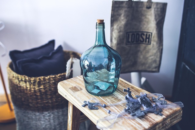
White is the blank canvas of color palettes. It’s crisp, open, and versatile, but lean on it too hard and it risks feeling sterile or uninviting. Minimalists love it, but smart vloggers pair it with texture or warmth to avoid looking like a doctor’s office.
Gray is a shapeshifter. It can read modern or moody depending on what surrounds it. Its flexibility makes it a solid base, but overuse can drain a room—or a frame—if you’re not careful. It needs contrast to stay interesting.
Beige and taupe are the middle ground. Soft, approachable, and a bit of a comeback story after years of being labeled boring. They offer warmth without creating hard edges. In vlogs, they act like insulation—inviting but neutral enough to let your story shine.
Then there are the earth tones. Think clay, stone, and sand. These neutrals ground things. They feel stable, timeless, and human. For creators looking to build a trusted visual identity, earthy neutrals are less trend, more backbone.
Personal and Cultural Influence on Color Preferences
The Power of Background and Experience
Color isn’t just a visual element—it’s deeply intertwined with who we are. Our personal experiences, upbringing, and cultural environment significantly shape how we perceive and respond to color.
- Some cultures associate red with luck and celebration, while others may see it as a symbol of danger or warning
- A person raised near the ocean might have a natural preference for cool tones like teal and seafoam green
- Memory and emotion often anchor our reactions to specific hues
Understanding how people relate to color based on where they come from and what they’ve experienced helps create more thoughtful, relatable design choices.
Balancing Personality and Purpose
Choosing colors is more than following trends—it’s about matching mood and meaning. Effective color selection adapts to both the user and the use of the space.
Consider the following factors:
-
Individual Personality:
-
Bold personalities may gravitate toward vibrant, high-energy tones like orange or electric blue
-
Introverted or calm individuals might prefer muted, earthy hues that promote relaxation
-
Function of the Space:
-
Home offices benefit from focus-enhancing neutrals and soft blues
-
Social spaces like living rooms thrive with warm, welcoming shades
-
Bedrooms often call for soothing palettes that support rest and mindfulness
A Harmonious Approach
To create harmony between personal style and spatial function, color choices should reflect both identity and intention. When designers consider the full context of culture, personality, and purpose, the result is a space that feels both authentic and functional.
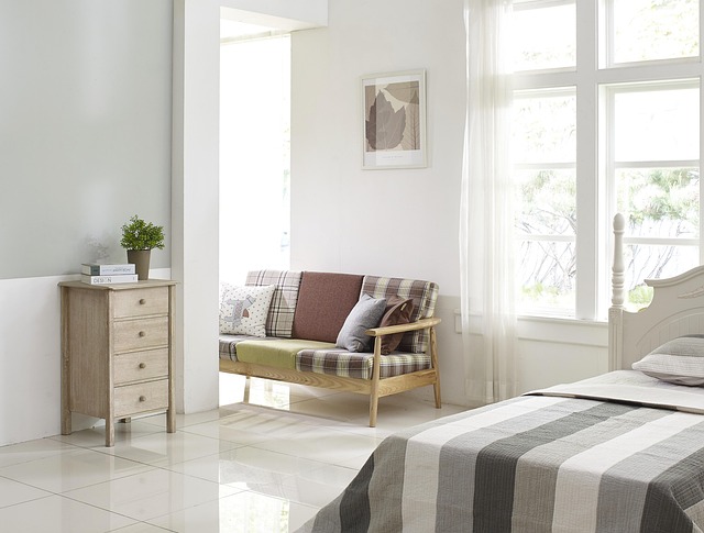
Building a color palette that feels unified but not flat takes a bit of intention. Step one: pick a limited base palette, maybe three to five shades that anchor the whole space. Think in tones—earthy, muted, warm neutrals, etc.—so they naturally flow room to room. Then change up the texture, saturation or balance to avoid a cookie-cutter feel. Uniform doesn’t have to mean boring.
Next, use color with function. Use brighter tones in the kitchen to kickstart mornings—yellows or fresh greens can do the trick. Save deeper, cooler shades like blues or soft grays for bedrooms where the goal is calm and quiet. It’s not about being trendy. It’s about using color to match daily rhythms.
Accent colors are your wildcard. The trick is to introduce one or two throughout the home to tie everything together without visual overload. A rust-toned throw pillow in the living room? Repeat it as a vase or wall print in the hallway. If it looks good once, it doesn’t mean it needs to scream. Subtle repetition keeps things dynamic but grounded.
Using Color Deliberately in Clean Aesthetic Styles
Minimalist vlogging setups are leaning harder into intentional color choices. It’s not about splashing every frame with bright pops. It’s about restraint—choosing shades that do more with less. Think warm greys, muted terracottas, soft olives. These aren’t just paint swatches. They’re tools for framing mood, brand, and message without shouting.
In clean aesthetics, subtle contrast matters more than loud combinations. A soft cinnamon backdrop can make a product callout stand out. A mossy green overlay on a thumbnail can signal calm, sustainability, or thoughtfulness without needing words. Smart creators are studying color psychology the way others study SEO.
This method ties closely to Scandinavian interior design thinking. It’s quiet, but calculated. Deliberate, not dull. For more on this visual philosophy in action, check out Scandinavian Interior Design: Minimalism with Warmth.
Color seems simple, but it’s one of the most powerful tools in a creator’s kit. It’s not just about what looks nice. It’s about how a room feels when someone steps in or swipes past it on a feed. Are you aiming for calm or energy? Trust or boldness? That all starts with color.
The best design choices come from intention. Before you grab a swatch or tweak a filter, ask what message or mood you want the space to send. Soft neutrals whisper comfort. Deep blues create calm. Saturated reds scream for attention. None of these are wrong—but each one should match the vibe you’re building.
A common trap is picking colors just because you like them. That’s not strategy; that’s luck. Good creators use color with purpose, connecting tone to brand, mood to message. You’re building a visual language—and color is your first sentence.
 Rovelle Vosswynne has opinions about gardening and landscaping tips. Informed ones, backed by real experience — but opinions nonetheless, and they doesn't try to disguise them as neutral observation. They thinks a lot of what gets written about Gardening and Landscaping Tips, DIY Project Tips, Home Renovation Ideas is either too cautious to be useful or too confident to be credible, and they's work tends to sit deliberately in the space between those two failure modes.
Reading Rovelle's pieces, you get the sense of someone who has thought about this stuff seriously and arrived at actual conclusions — not just collected a range of perspectives and declined to pick one. That can be uncomfortable when they lands on something you disagree with. It's also why the writing is worth engaging with. Rovelle isn't interested in telling people what they want to hear. They is interested in telling them what they actually thinks, with enough reasoning behind it that you can push back if you want to. That kind of intellectual honesty is rarer than it should be.
What Rovelle is best at is the moment when a familiar topic reveals something unexpected — when the conventional wisdom turns out to be slightly off, or when a small shift in framing changes everything. They finds those moments consistently, which is why they's work tends to generate real discussion rather than just passive agreement.
Rovelle Vosswynne has opinions about gardening and landscaping tips. Informed ones, backed by real experience — but opinions nonetheless, and they doesn't try to disguise them as neutral observation. They thinks a lot of what gets written about Gardening and Landscaping Tips, DIY Project Tips, Home Renovation Ideas is either too cautious to be useful or too confident to be credible, and they's work tends to sit deliberately in the space between those two failure modes.
Reading Rovelle's pieces, you get the sense of someone who has thought about this stuff seriously and arrived at actual conclusions — not just collected a range of perspectives and declined to pick one. That can be uncomfortable when they lands on something you disagree with. It's also why the writing is worth engaging with. Rovelle isn't interested in telling people what they want to hear. They is interested in telling them what they actually thinks, with enough reasoning behind it that you can push back if you want to. That kind of intellectual honesty is rarer than it should be.
What Rovelle is best at is the moment when a familiar topic reveals something unexpected — when the conventional wisdom turns out to be slightly off, or when a small shift in framing changes everything. They finds those moments consistently, which is why they's work tends to generate real discussion rather than just passive agreement.